Mellavo
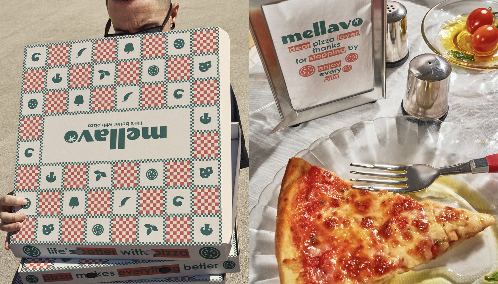
A pizza box people photograph before they open it.
The project
Most of this brand's customers never see the room. The box arrives at a door, sits on a table for twenty minutes and gets photographed once. That box is the shopfront.
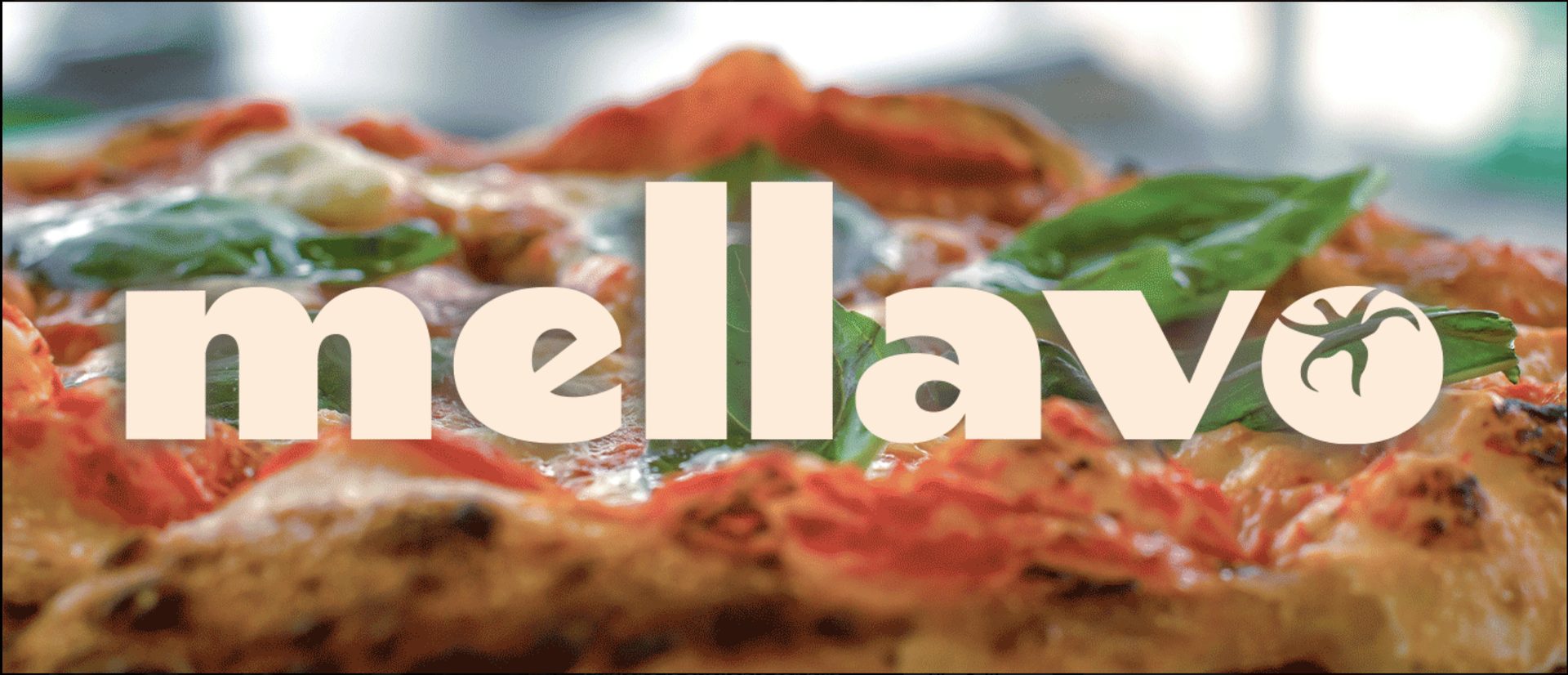
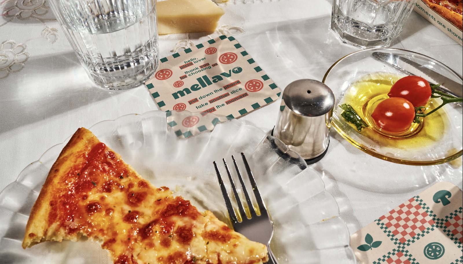
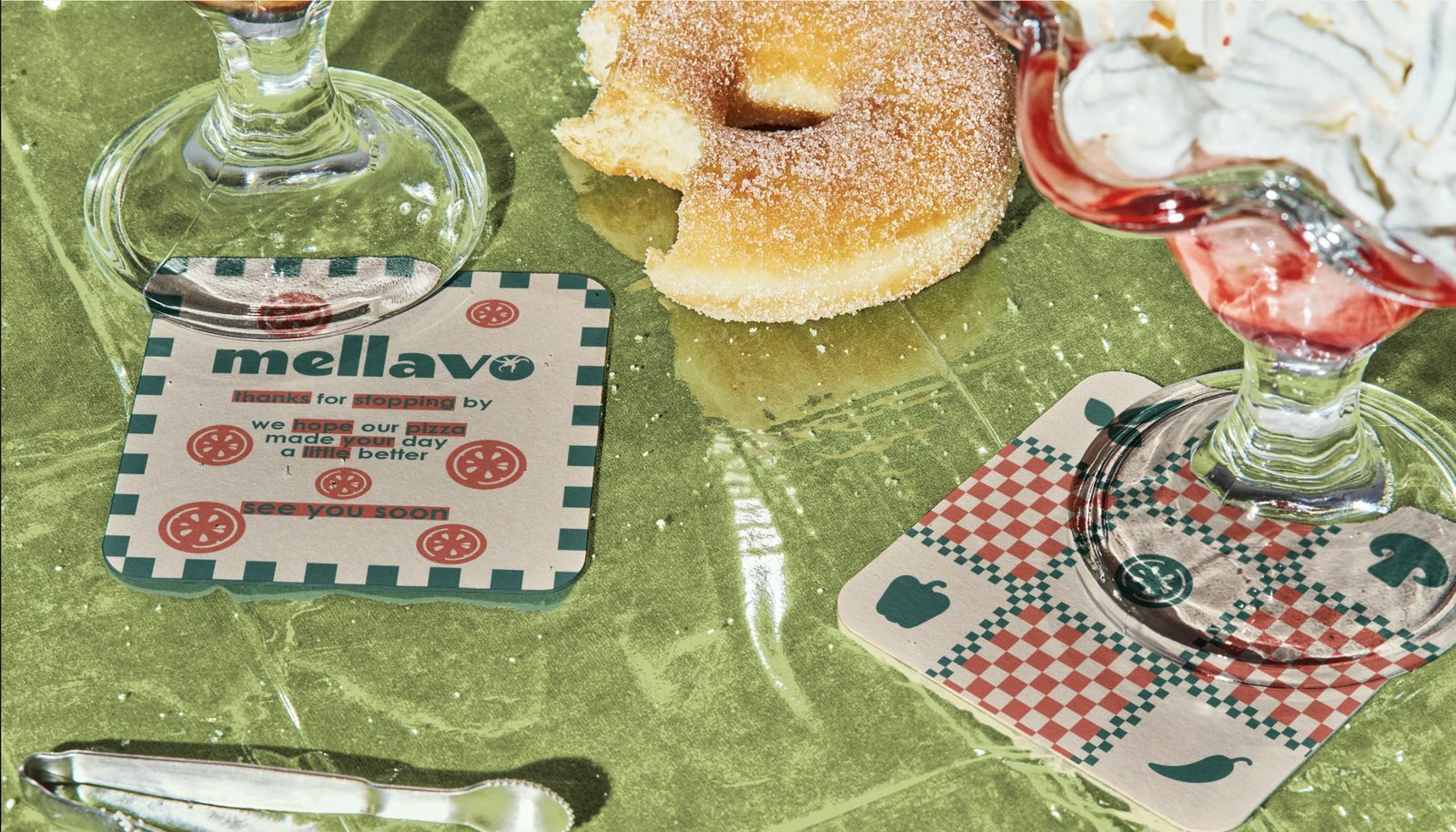
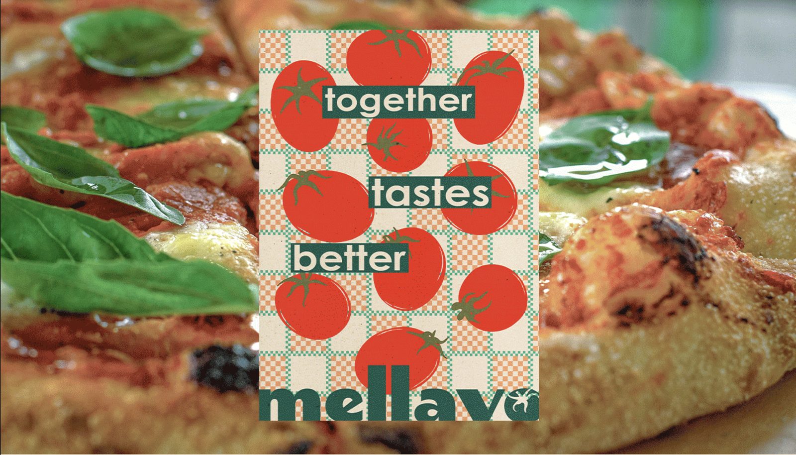
So the identity leads with a red and cream checkerboard rather than the mark. A pattern is recognisable at a distance, survives a cheap print, and can be cropped anywhere without breaking, which a logo cannot. The wordmark is a heavy geometric cut in cream, with a tomato sitting in the counter of the final o, set large and set once.
Everything downstream follows from that. The pattern is the brand and the wordmark confirms it.
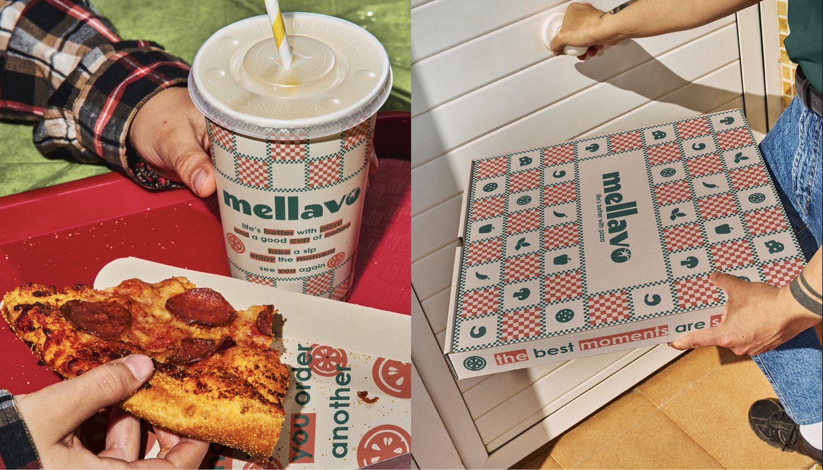
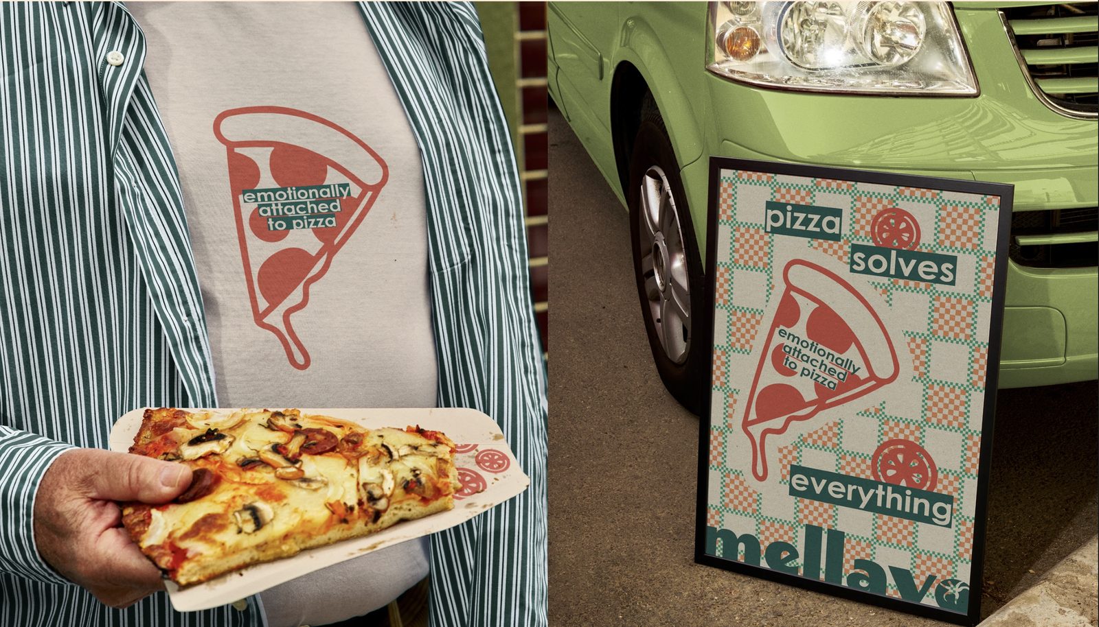
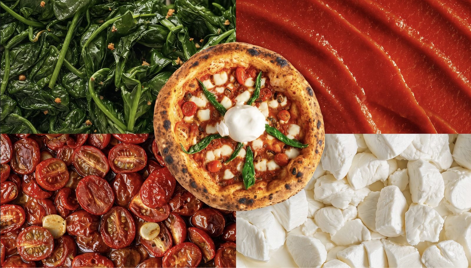
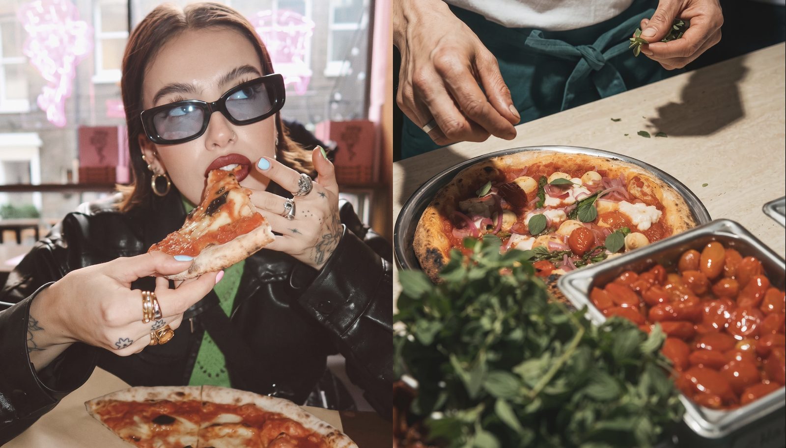
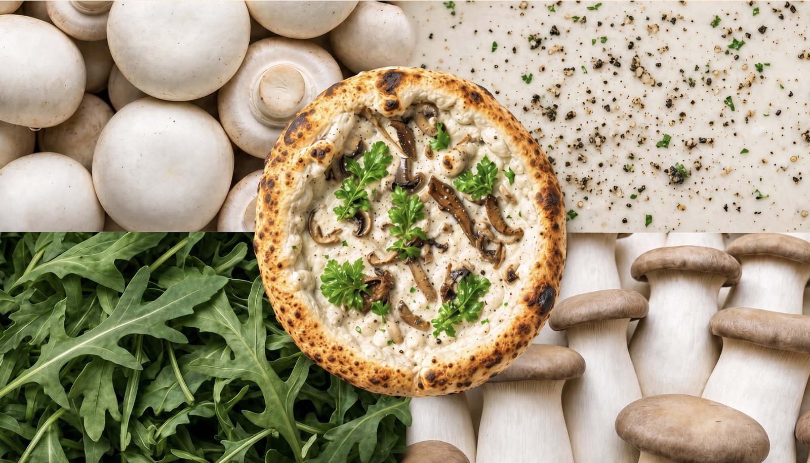
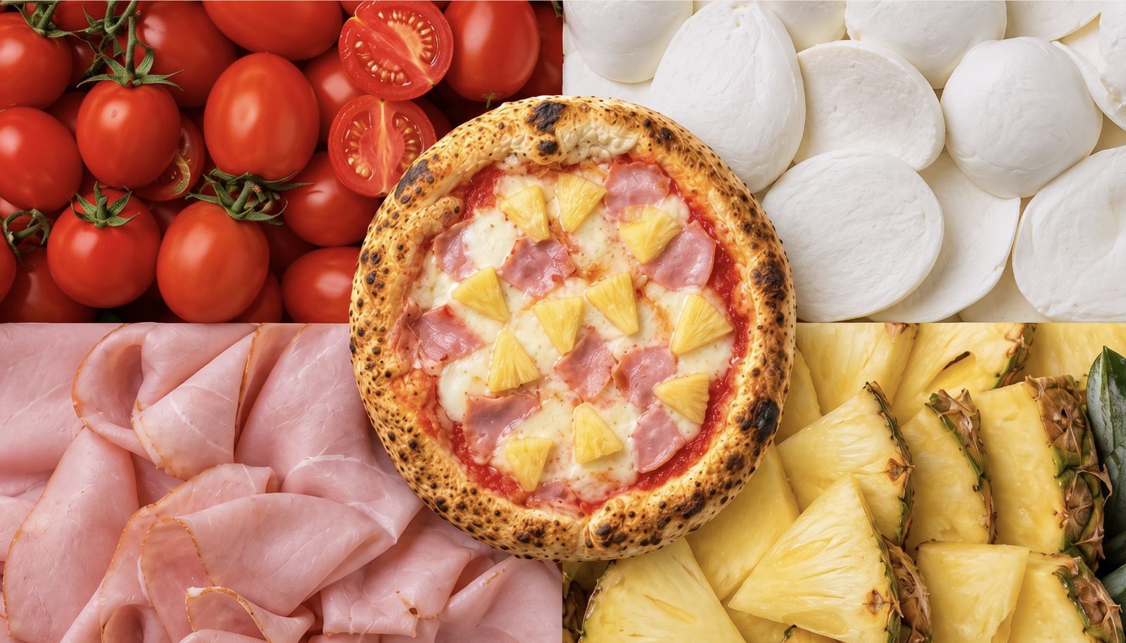
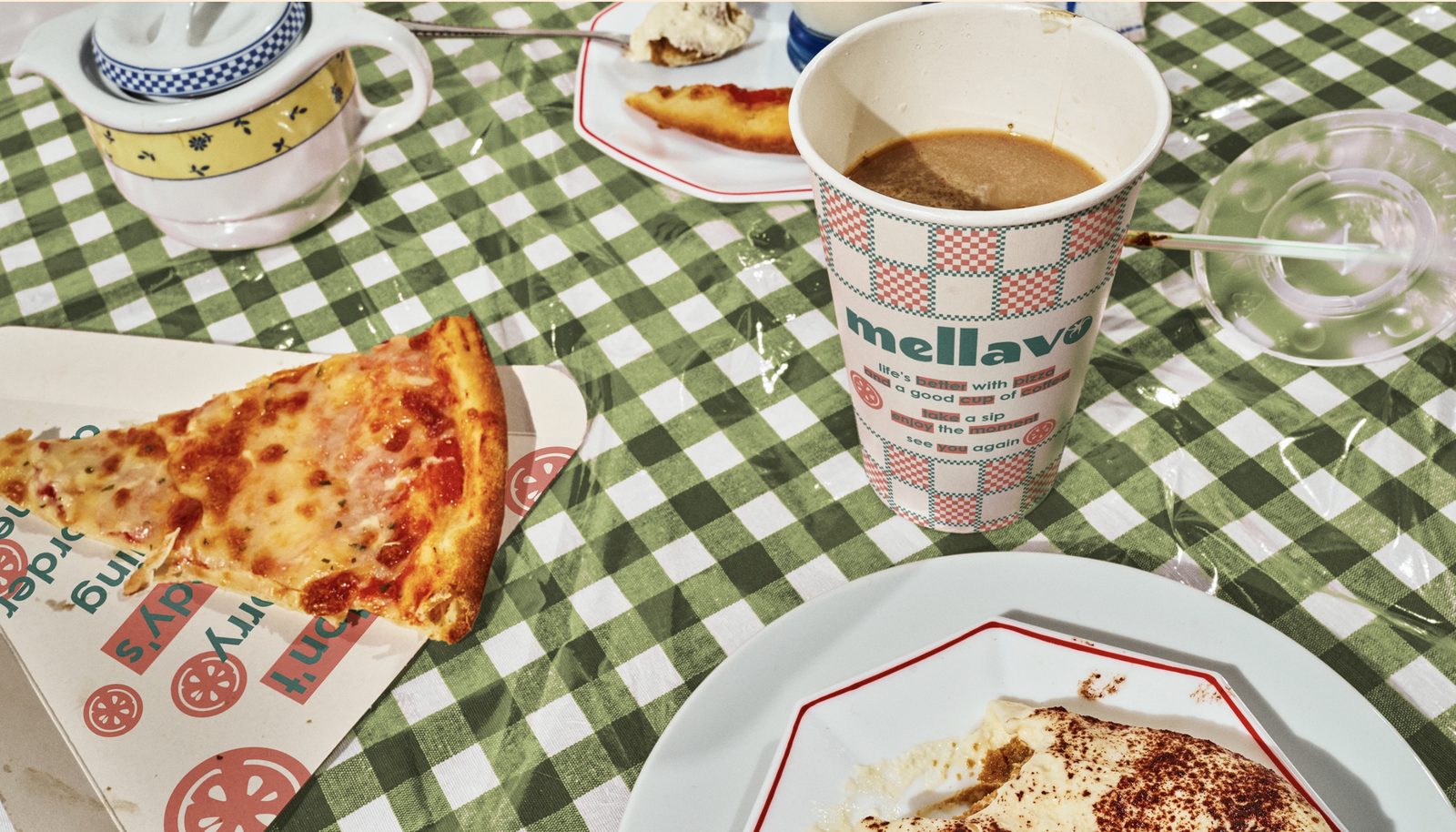
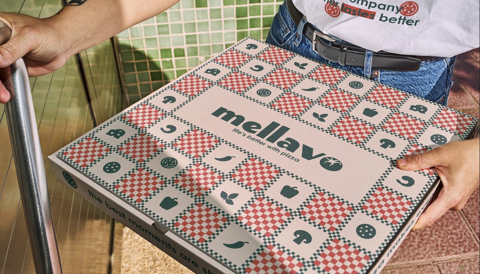
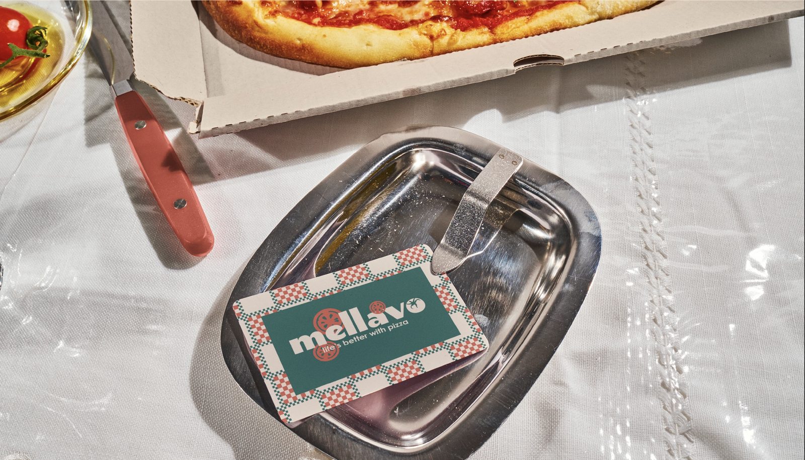
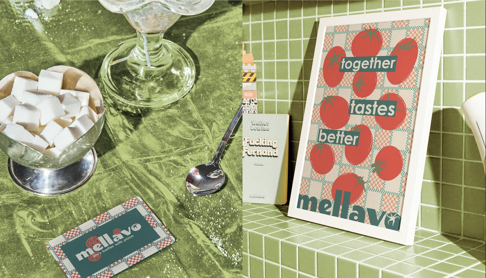
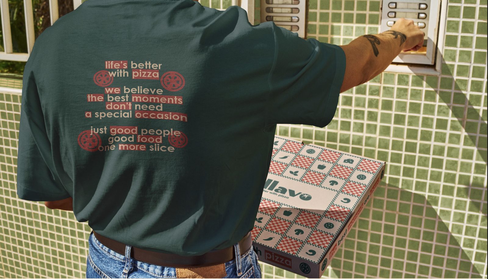
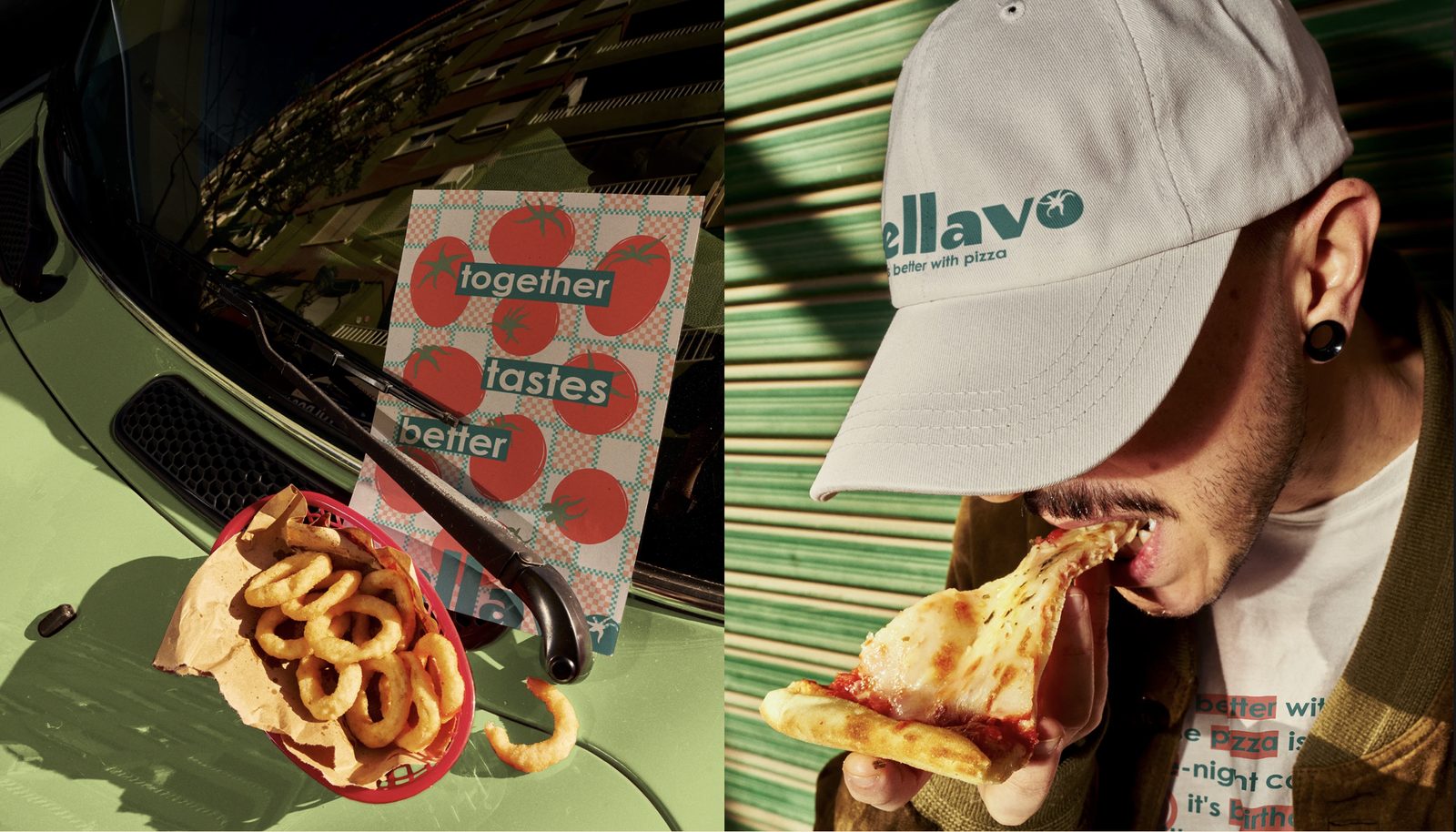
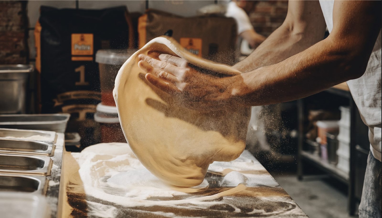
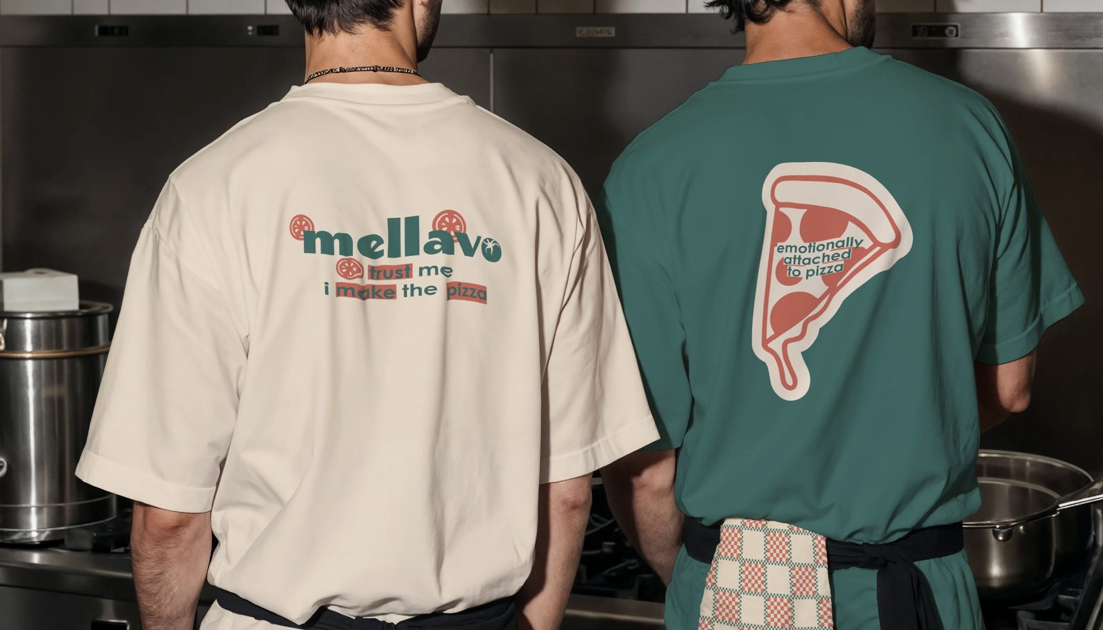
On a delivery brand the box is not packaging. It is the shopfront.Mellavo, pizzeria
The system
Two sizes, and that is the whole rule
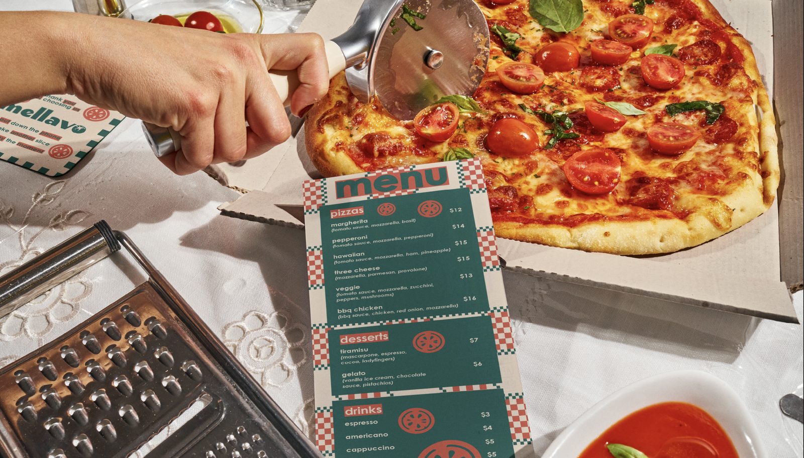
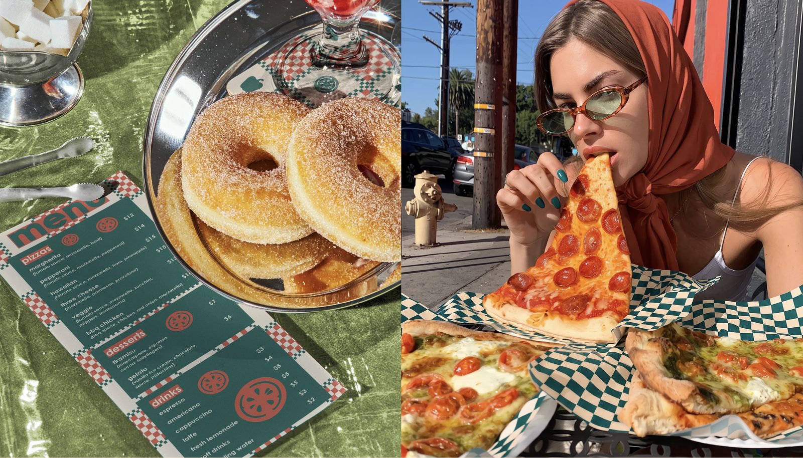
The menu runs on a strict two size system. A name and a price at one size, the ingredients at another. No third size exists, which is what keeps a menu with forty items on it from reading like a spreadsheet.
Every printed item was specified for two colour work on brown and on white board, with the checker sized so it never falls awkwardly across a fold. Small detail, and the reason the boxes look bought rather than printed.
Specification
- System
- Checkerboard · cream wordmark · ingredient icons
- Palette
- Tomato · cream · olive · deep green
- Deliverables
- Strategy · Identity · Packaging · Menu system · Staff kit