Sencha House
An identity you notice with your hands first.

The project
Speciality tea has an aesthetic problem. It borrows from speciality coffee, which borrows from craft beer, which means a lot of tea gets sold in packaging that shouts at a customer who came in for the quiet.
Sencha House sells a ritual that takes four minutes and asks for attention. The brand had to behave the same way, which ruled out most of what the category does.
Every tea brand draws a leaf. Drawn badly it is clip art, drawn beautifully it is somebody else's clip art. So the leaf is not printed at all.

The approach
Take the ink out
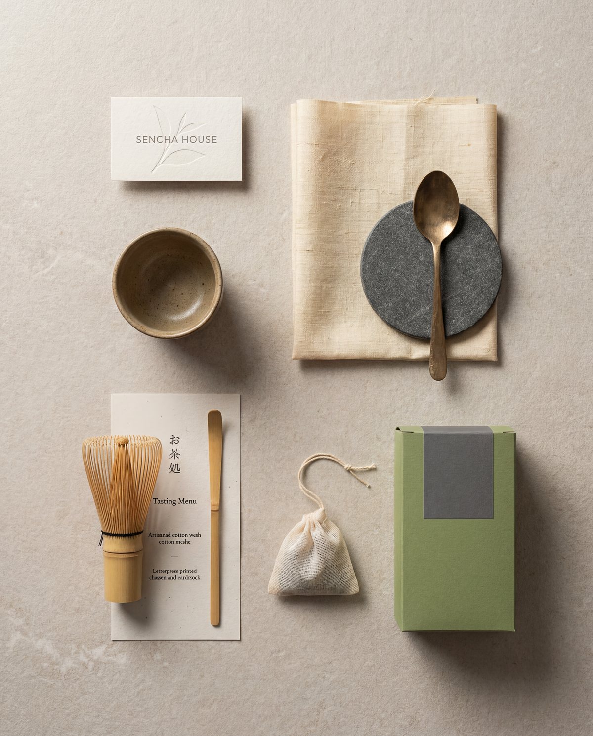
The primary application of the mark is a blind emboss. No colour at all. The leaf is pressed into uncoated cream stock and shows up only when the card is tilted toward a light.
That one decision solves several problems at once. It is unmistakably not clip art, it costs less than a five colour print job, and it turns a business card into something a customer keeps because it feels like something.
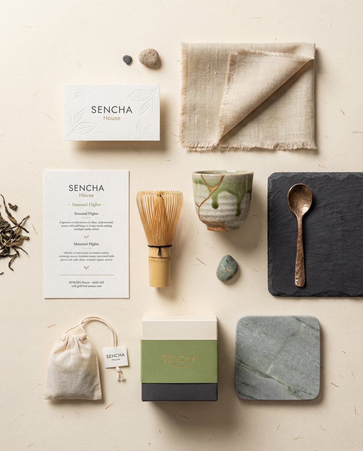
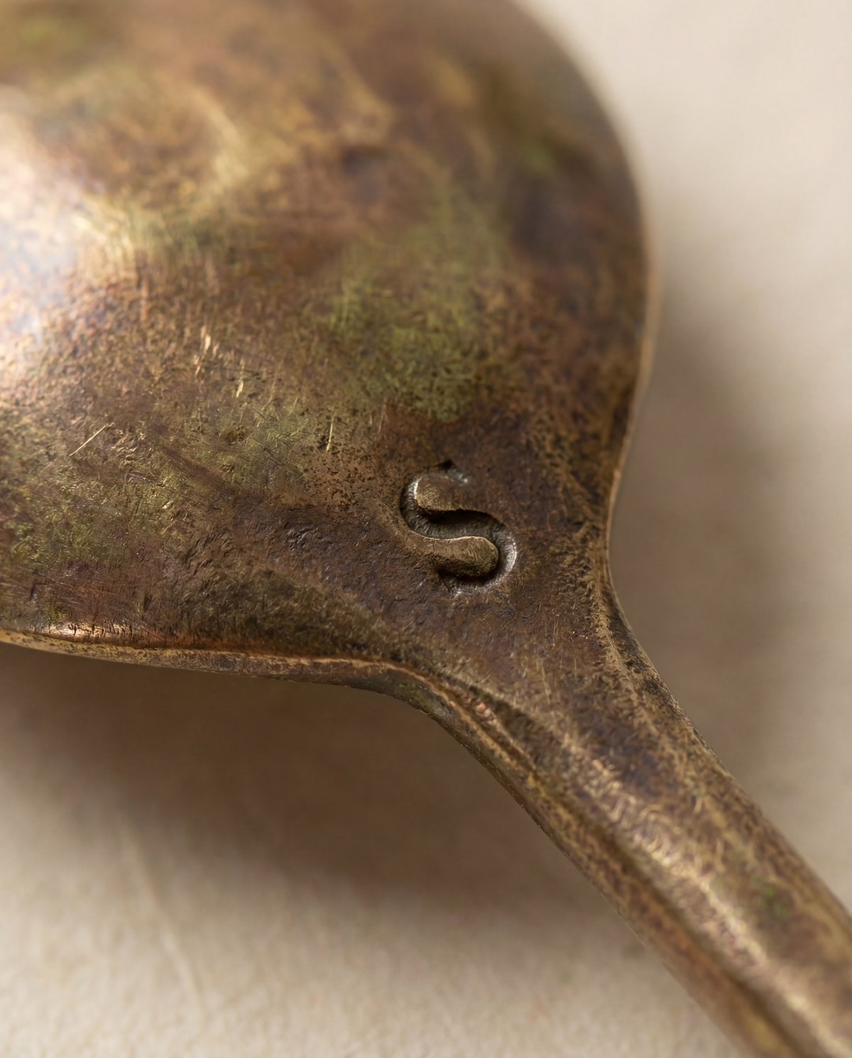
Colour, where it appears, is matcha green on linen and a warm bronze on the tools. The brand's most expensive looking asset is an empty piece of paper.
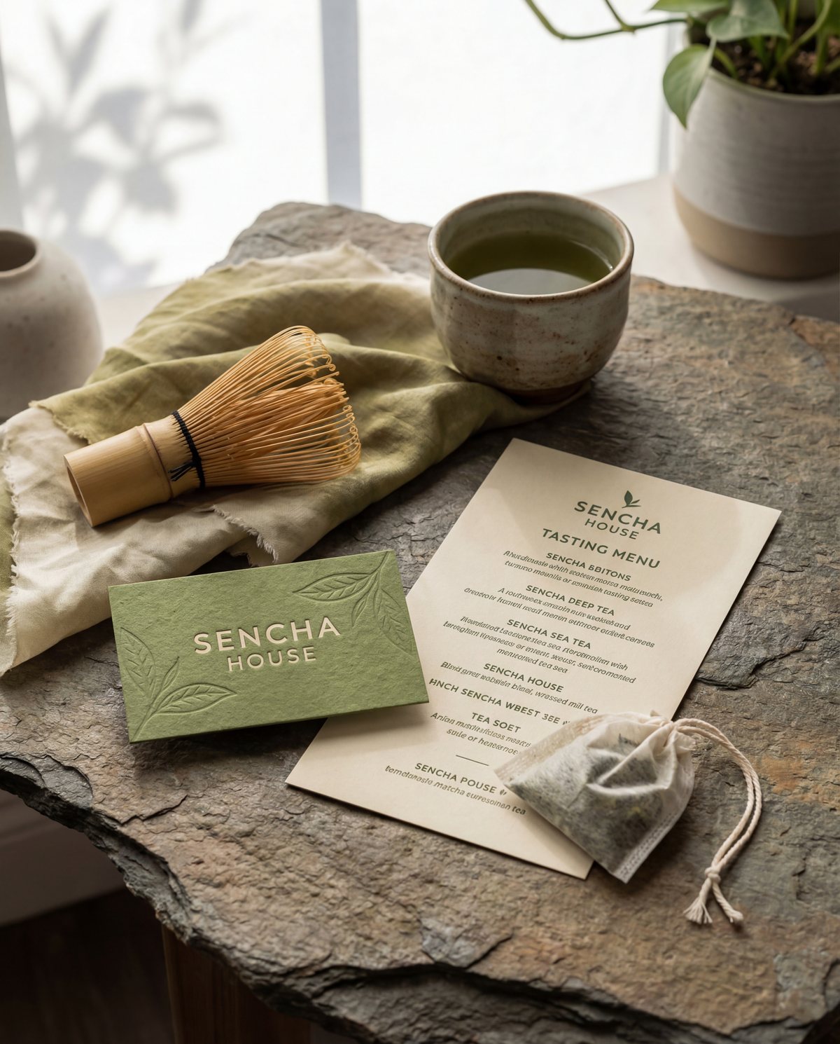
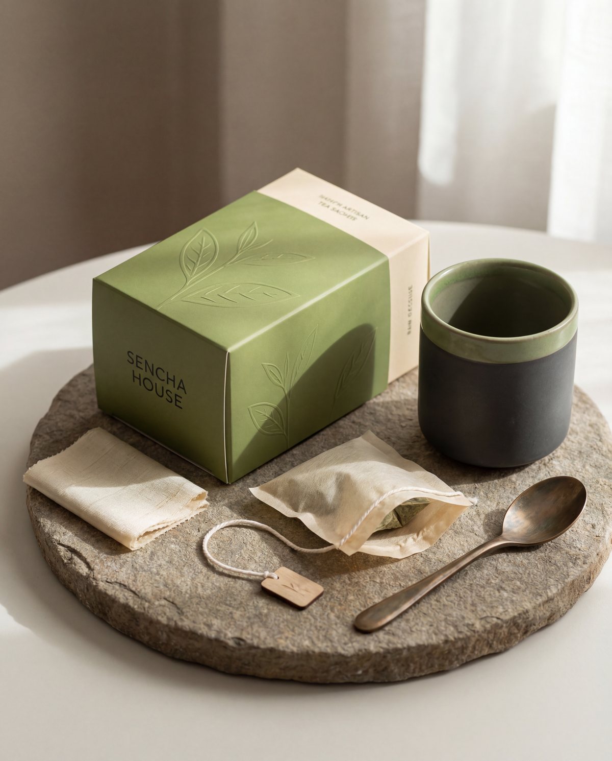
The mark works because it is pressed into the paper rather than printed onto it.Sencha House, tea house and retail
The solution
Collateral built to be handled
The delivered set covers cards, menus, tags, a cotton pouch, tins and shelf tickets. Every item specifies stock weight and finish alongside the artwork, because on this brand the paper is part of the design and a substitution ruins it.
Menus are centred, which is unusual for us, because a tasting flight should read as a list of ceremonies rather than a price list. Line length is capped short across every piece, so the white space does as much work as the type.
The system holds without any of the usual props. No pattern, no illustration library, no secondary palette waiting to be misused.
Specification
- Marks
- Embossed leaf · wordmark · stacked lockup
- Palette
- Matcha · cream · bronze · deep olive
- Deliverables
- Strategy · Identity · Collateral · Packaging direction