Bottega Veneta
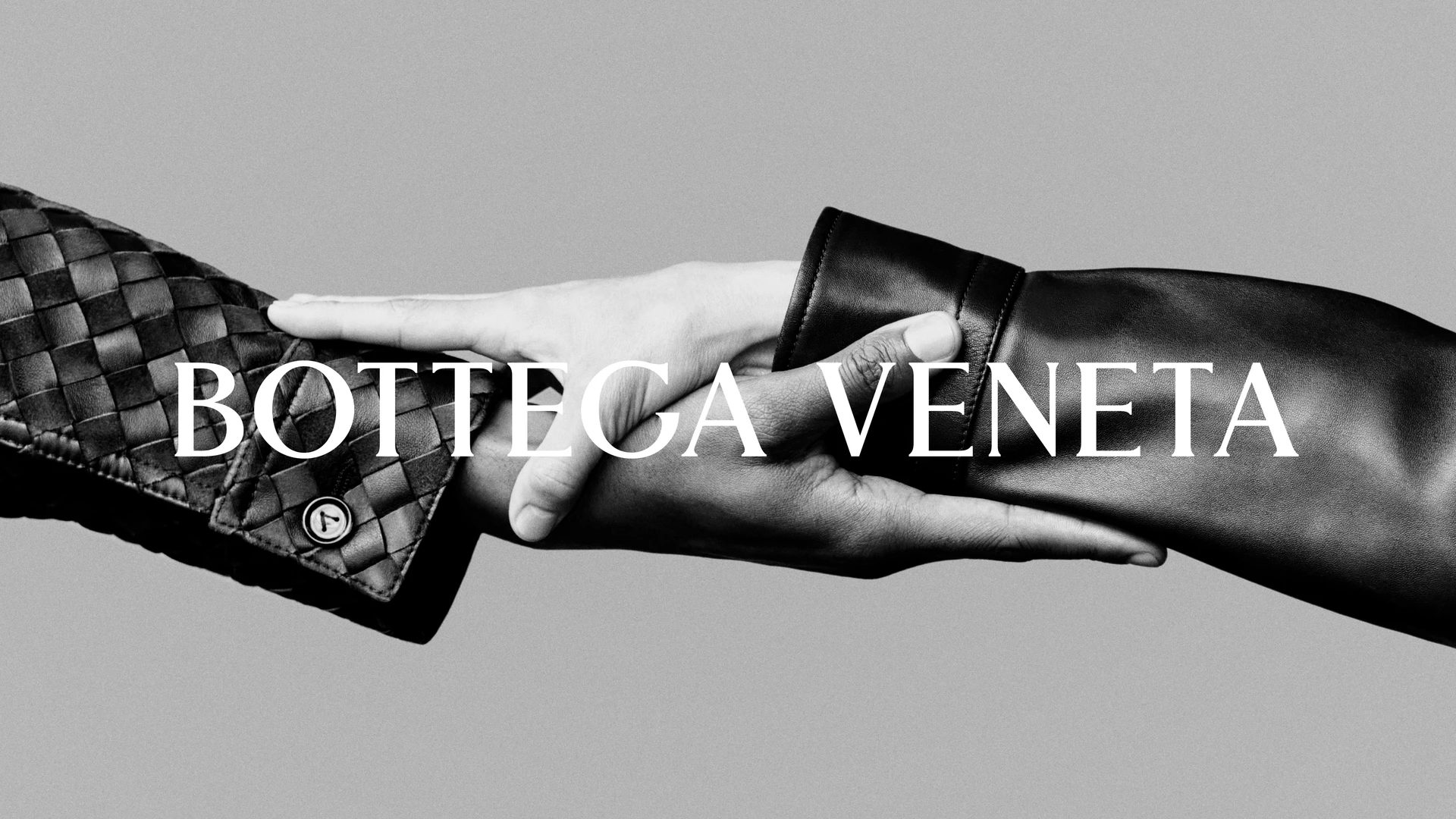
Take the colour out and the craft has nowhere to hide.

The context
Fashion campaigns are colour graded within an inch of their lives. Teal shadows, lifted blacks, a look that dates the image to the year it was made rather than the object it was made for.
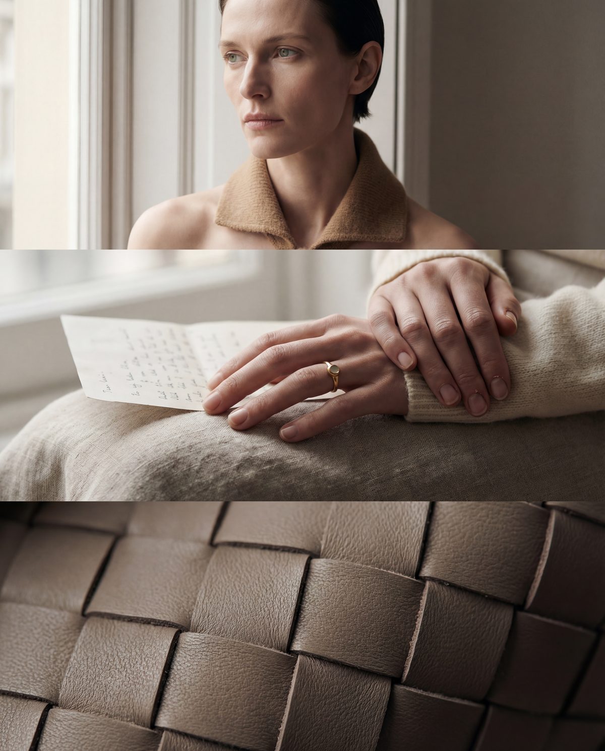
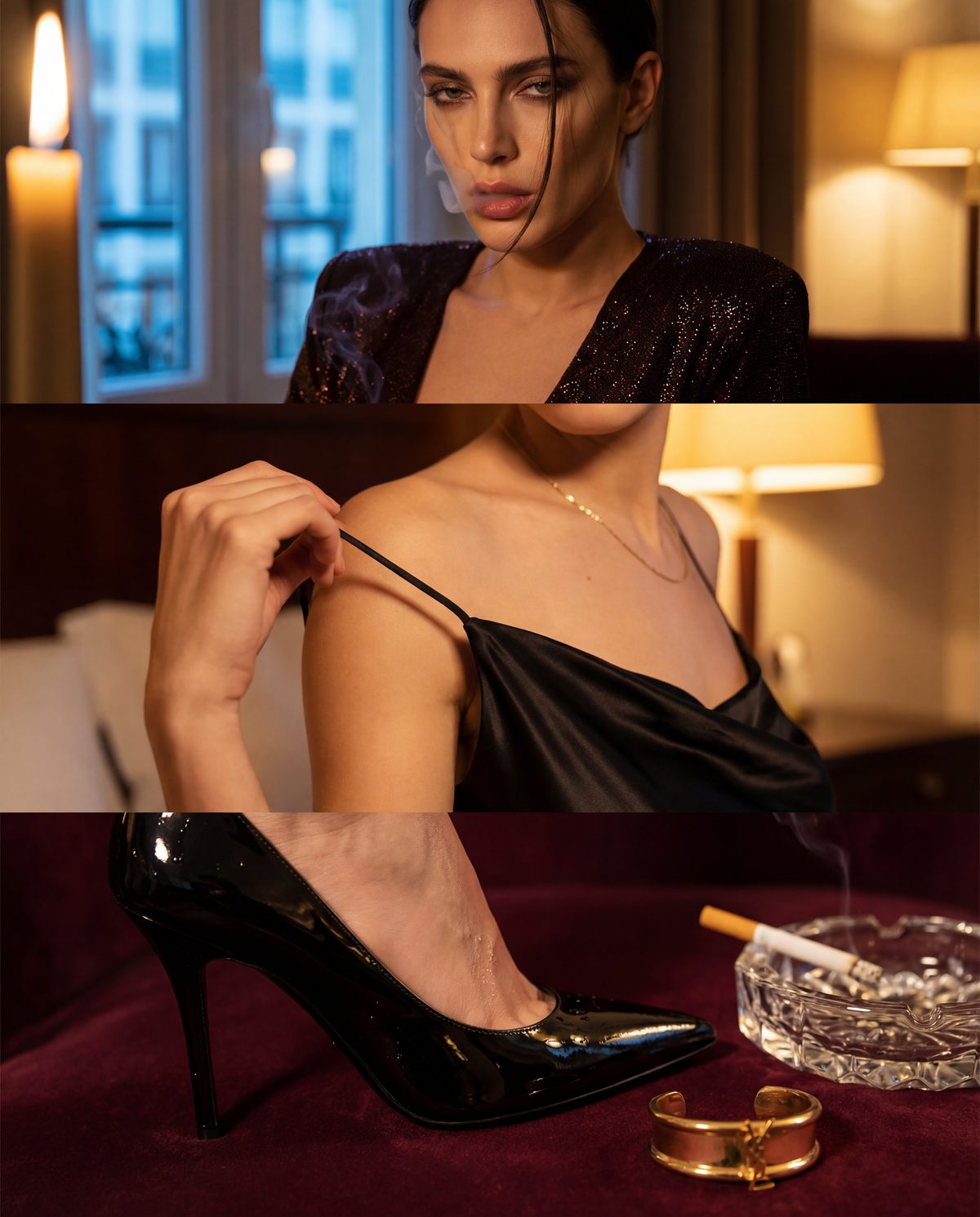
This one runs on two registers instead. The portraits keep their colour, but the colour comes from the light in the room rather than a grade applied afterwards. Window light, a candle, a bar sign. The campaign frames drop to black and white entirely, which is where the material has to do all the work.
The approach
Two distances, and nothing in between
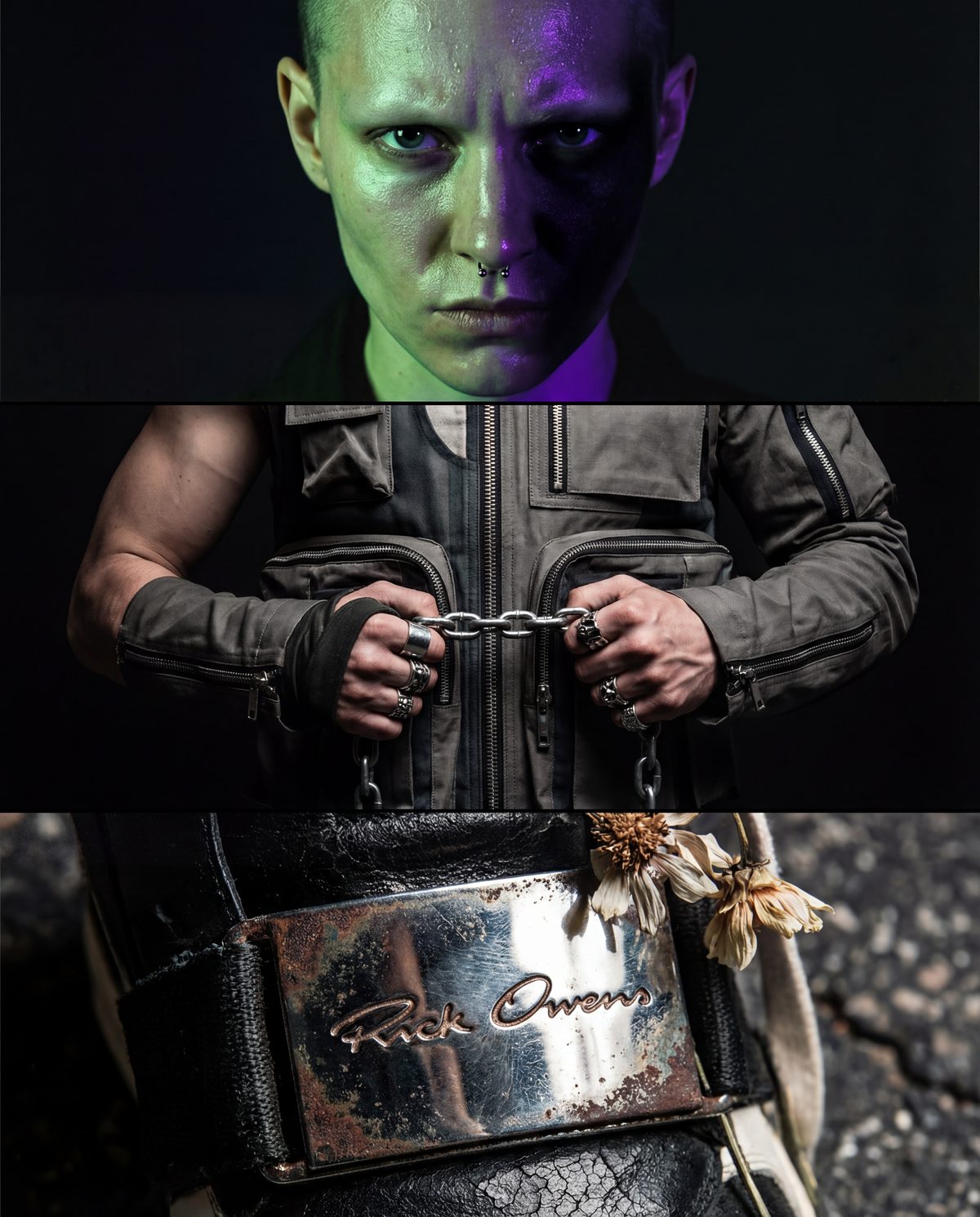
Every frame is either wide enough that the subject is a shape in a place, or close enough to count the stitching. The middle distance was cut from the system entirely, because it is where fashion imagery goes to look like everybody else.
Each panel stacks a portrait over the thing the portrait is about. A hand on a page above the weave itself. A face above the hardware. The pairing is the argument, so neither image has to explain itself.
Grain is heavy and deliberate. Highlights are allowed to blow, shadows are allowed to close. The only thing that must stay sharp is the material.
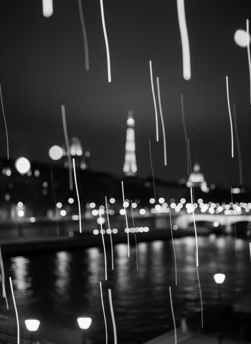
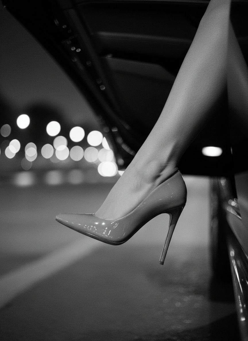
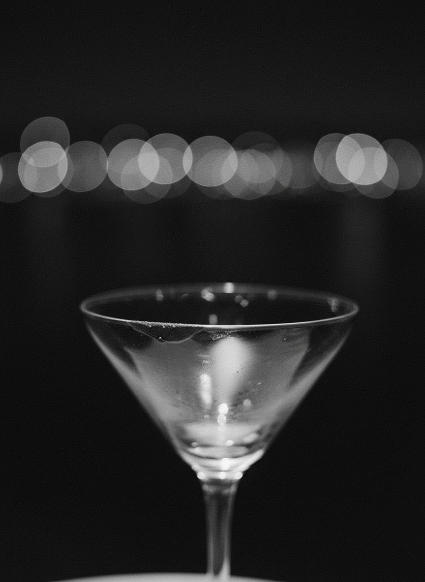
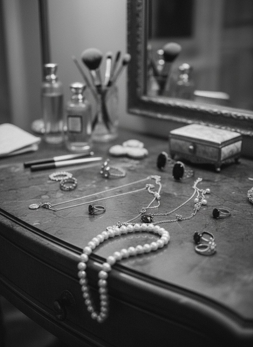
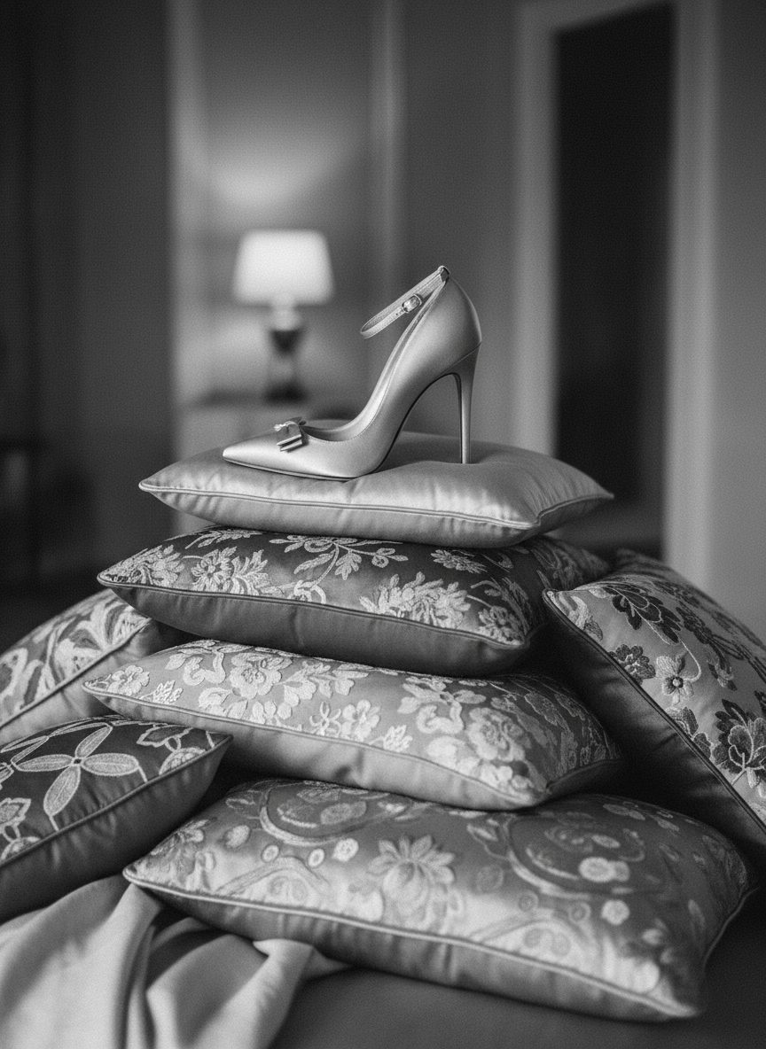
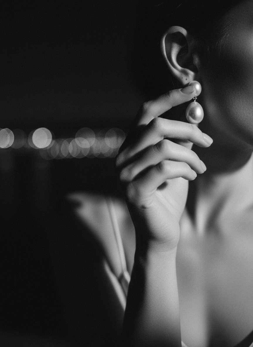
Cutting the middle distance out of the system is what made it look like one campaign.Bottega Veneta, campaign direction
The solution
A campaign that survives the crop
Every frame was built to be cut three ways. The safe area was set before the shoot rather than argued about afterwards, which is why the vertical crops do not look like damage.
The result has a narrow vocabulary. Two distances, one grain, one type placement. It gets recognisable quickly because there is very little of it to learn.
Specification
- Direction
- Monochrome · heavy grain · two distances
- Formats
- Billboard · print · 4:5 · 9:16
- Deliverables
- Campaign direction · Shot list · Crop system