Feynan Tours
Selling silence in a category that shouts.
The context
The primary product here is genuinely nothing. No engine noise, no light pollution, no signal. People pay to be somewhere that has been left alone.
Almost every operator in the category brands itself the same way. Saturated sunset photography, adventure typography, exclamation marks. They sell adrenaline to a customer who booked for the opposite.
The challenge
How do you make quiet look valuable?
Silence, darkness and emptiness are hard things to sell visually. The instinct is to compensate with more colour, more drama, more proof that something is happening. That instinct is what destroys the product.
The second constraint was reach. The same mark had to survive a hand painted roadside sign, a tour operator's brochure in Berlin and a forty pixel favicon, on a print budget that ruled out anything but flat colour.
The approach
Restraint as the strategy, not the style
We positioned Feynan against the category rather than inside it. Where competitors promise experience, Feynan promises absence. Everything downstream had to earn its place against that one sentence.
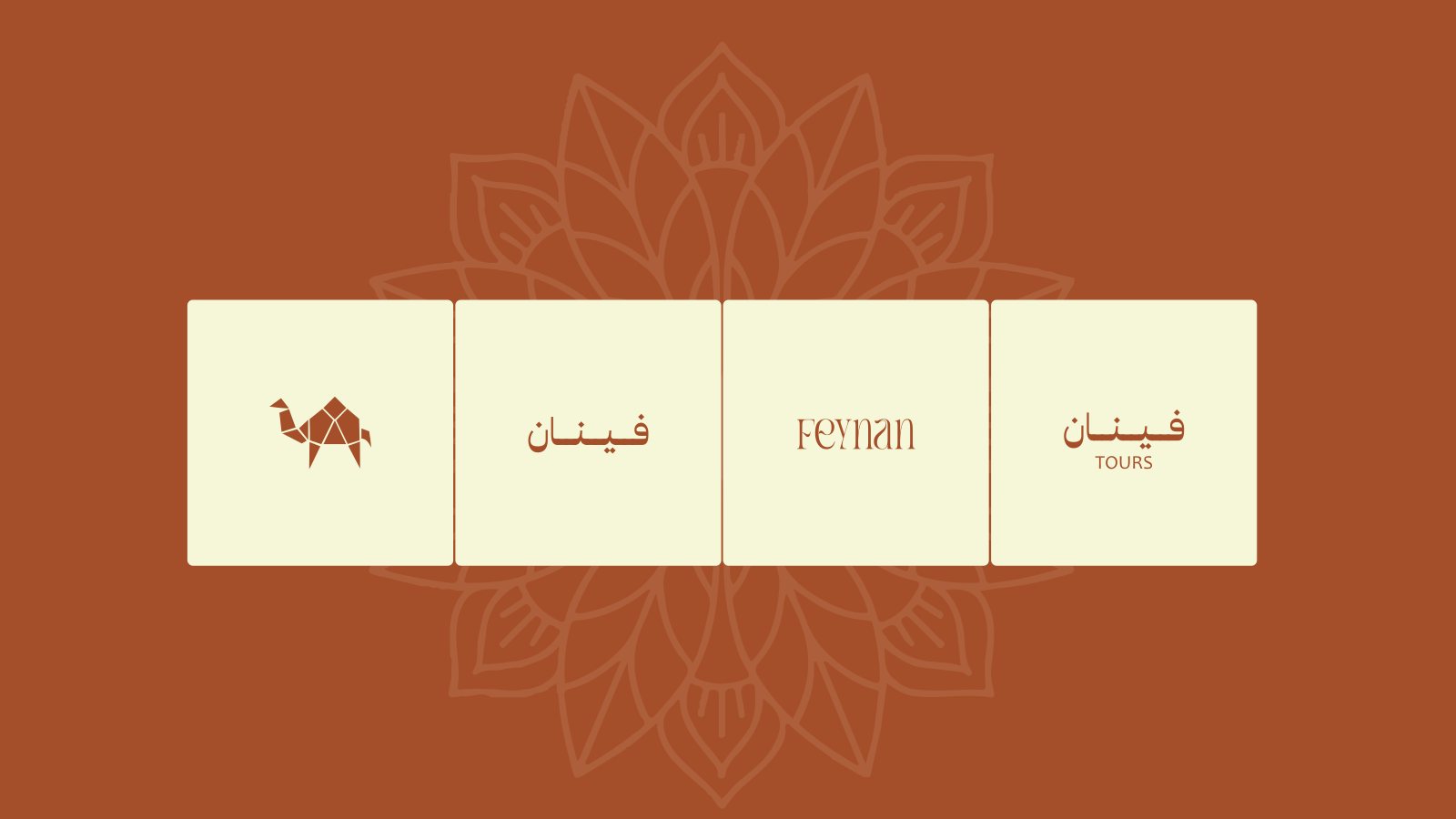
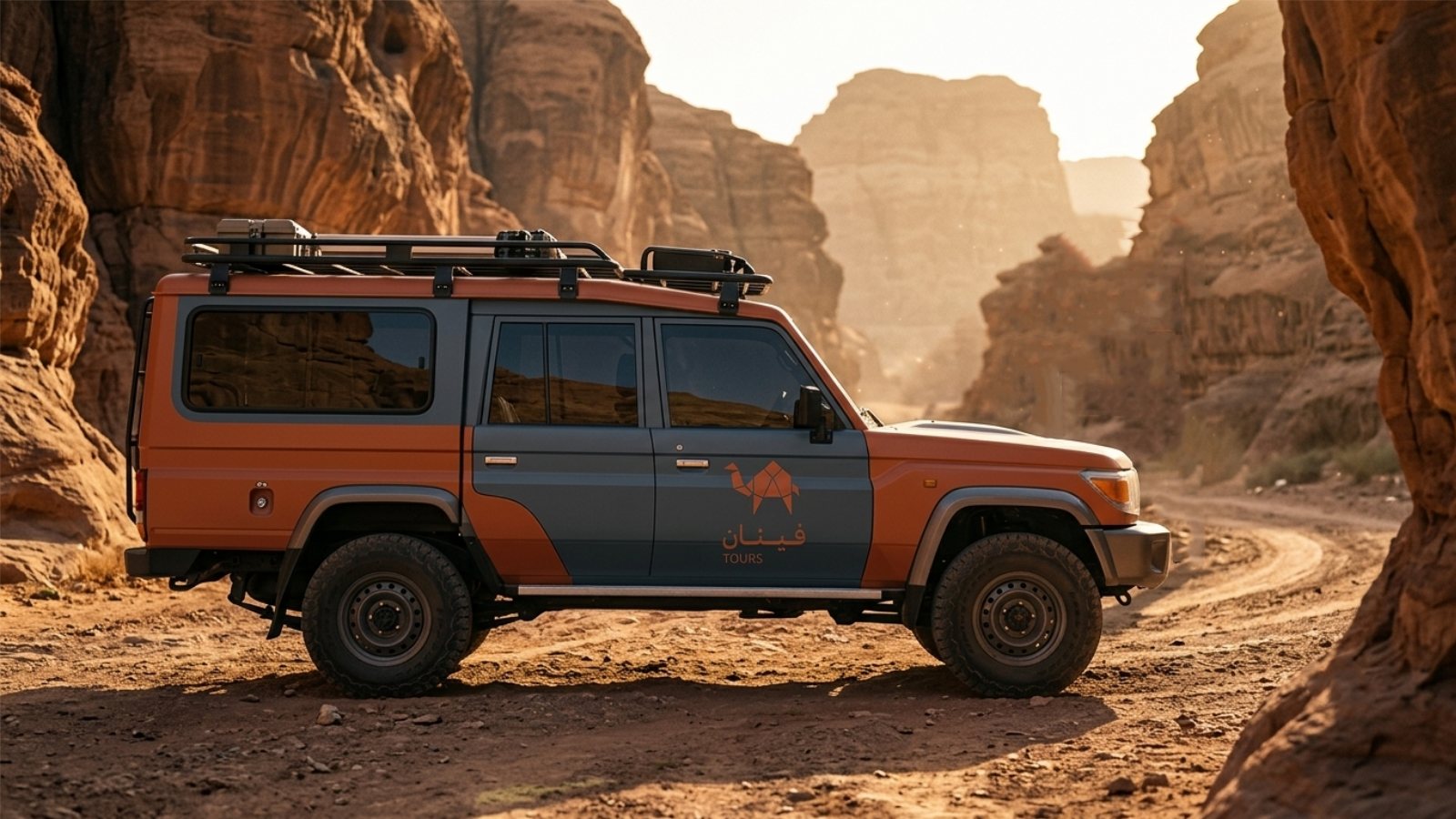
The mark is a camel reduced to folded planes. Geometric enough to read as considered rather than decorative, warm enough to avoid the coldness minimalism usually brings. It survives embroidery on a jacket, a stamp on a tin, and rendering at sixteen pixels.
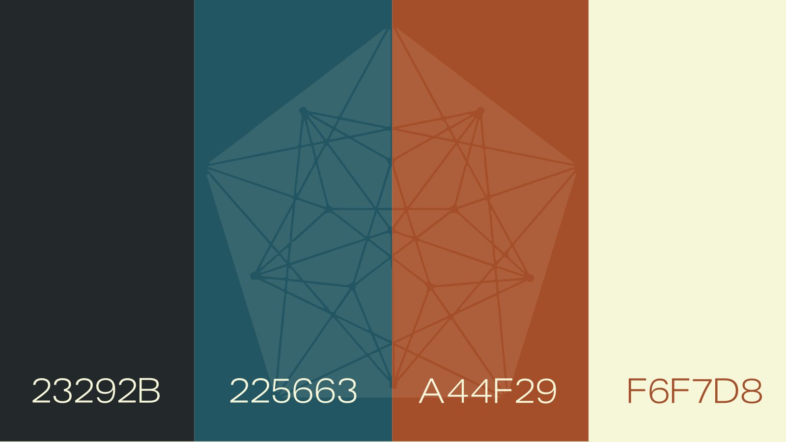
The palette came from the ground and nowhere else. Copper from the ore, deep teal from the sky an hour after sunset, bone from limestone, near black from the rock. Four colours, no gradients, no exceptions.
Typography
Legible at every size it has to live at
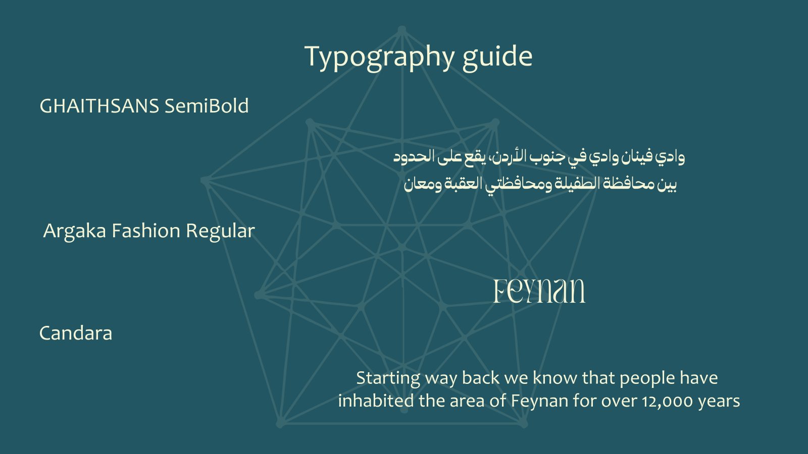
The Latin wordmark uses a high contrast display face with an unusually low waistline. It reads as considered and slightly old, which suits a place measured in millennia. Body copy sits in a humanist sans that stays legible on a sun bleached sign.
The Arabic was drawn to match rather than translated. فينان carries the same stroke contrast and optical weight as Feynan, so a bilingual sign reads as one object rather than two.
The solution
A system that behaves the way the place does
The finished identity is deliberately sparse. Large areas of flat colour, one illustration style, generous margins, and a rule that no layout may carry more than two typographic sizes. It looks like the product feels.
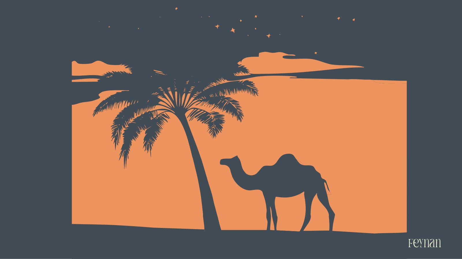
The illustration language gives the brand somewhere to be expressive without breaking the rule about restraint. It is the only place in the system where anything decorative is allowed to happen.
One decision made in week one runs through every mark, colour and layout in the finished system. Nothing in it arrived by taste alone.
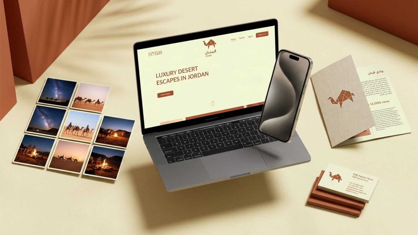
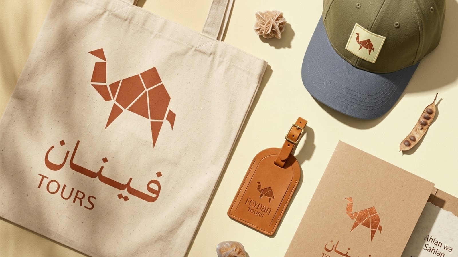
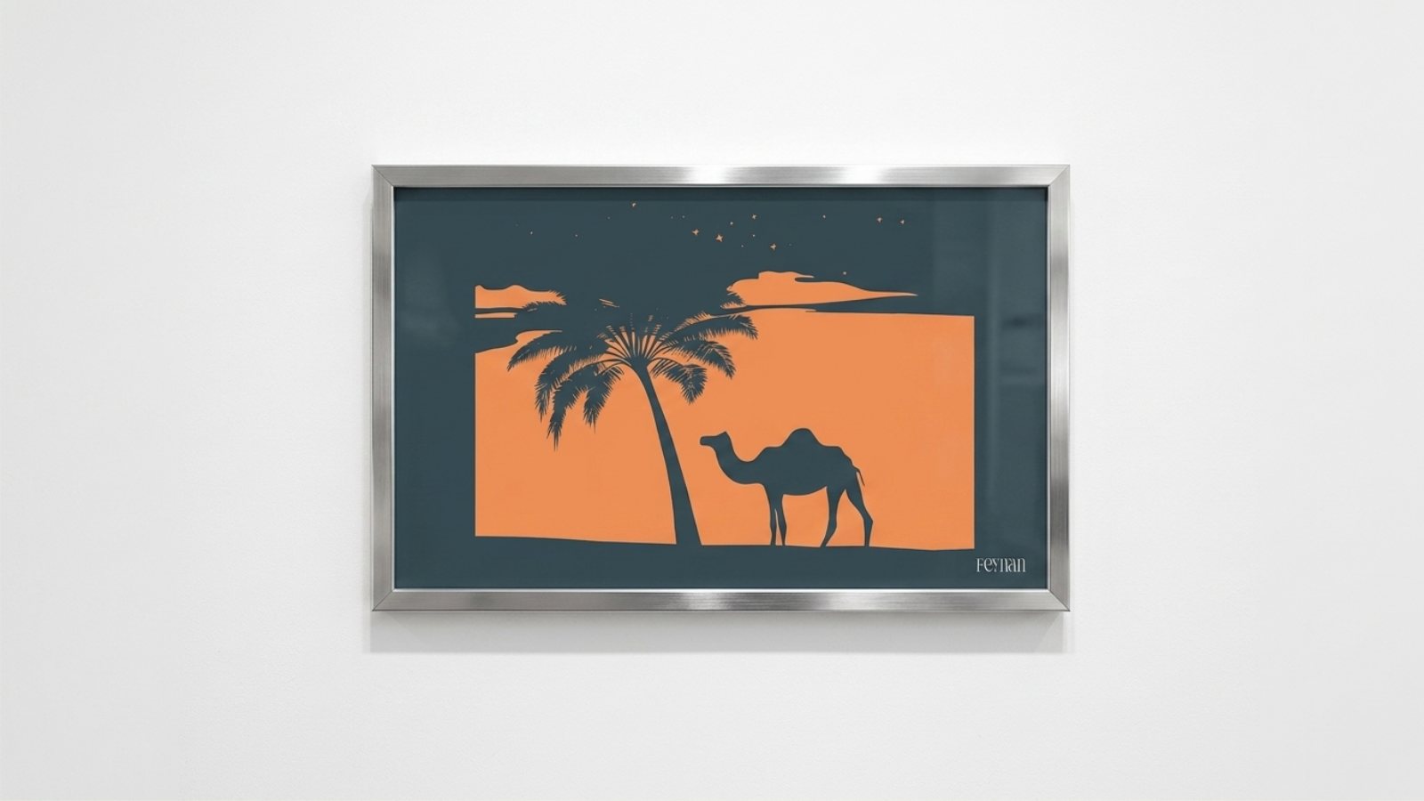
A positioning decision made in week one, traceable through every mark in the final system.Feynan Tours, desert eco-tourism
Specification
- Typefaces
- Argaka Fashion · Candara · GHAITHSANS
- Palette
- 4 flat colours, no gradients
- Deliverables
- Strategy · Logo suite · Bilingual type · Illustration · Livery · Guidelines