Underbaked
A bakery that reads as calm before it reads as bread.
The project
Bakeries tend to look loud. Warm yellows, wheat illustrations, a script logo doing an impression of handwriting. The category has settled on one costume and nearly everybody wears it.
Underbaked wanted the opposite. The room is quiet, the product is plain and good, and the name is a small joke told with a straight face. None of that survives a wheat illustration.
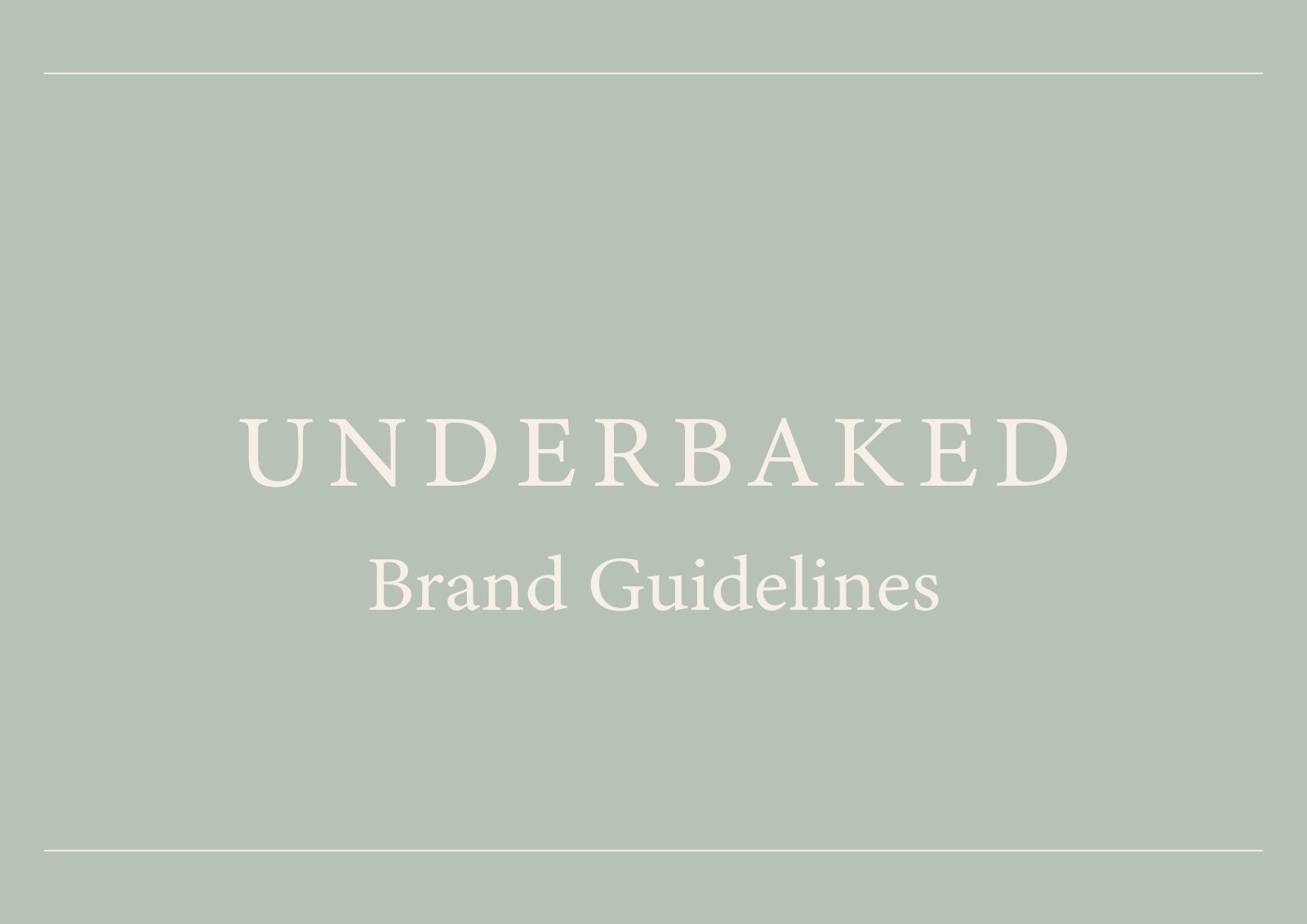
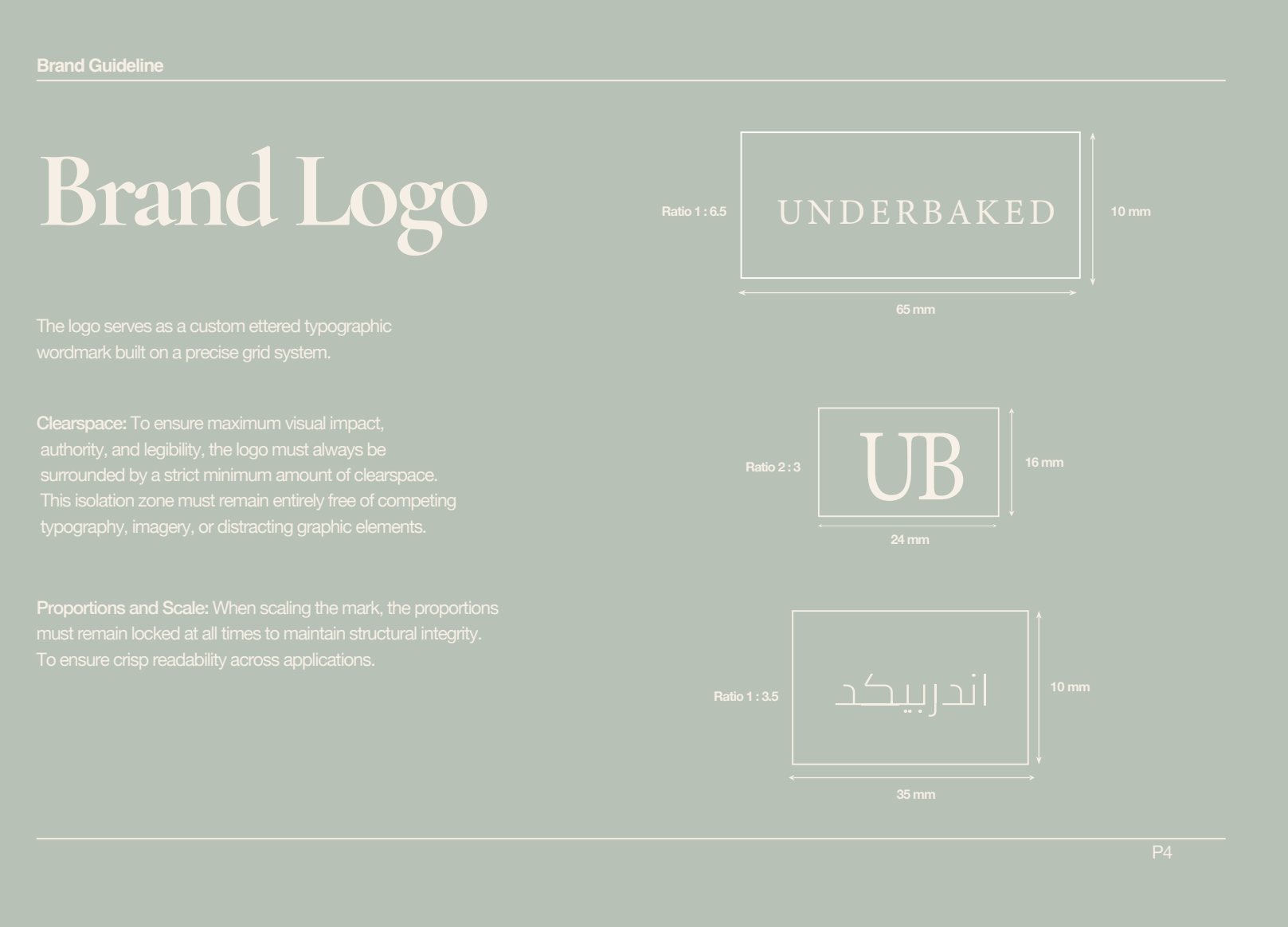
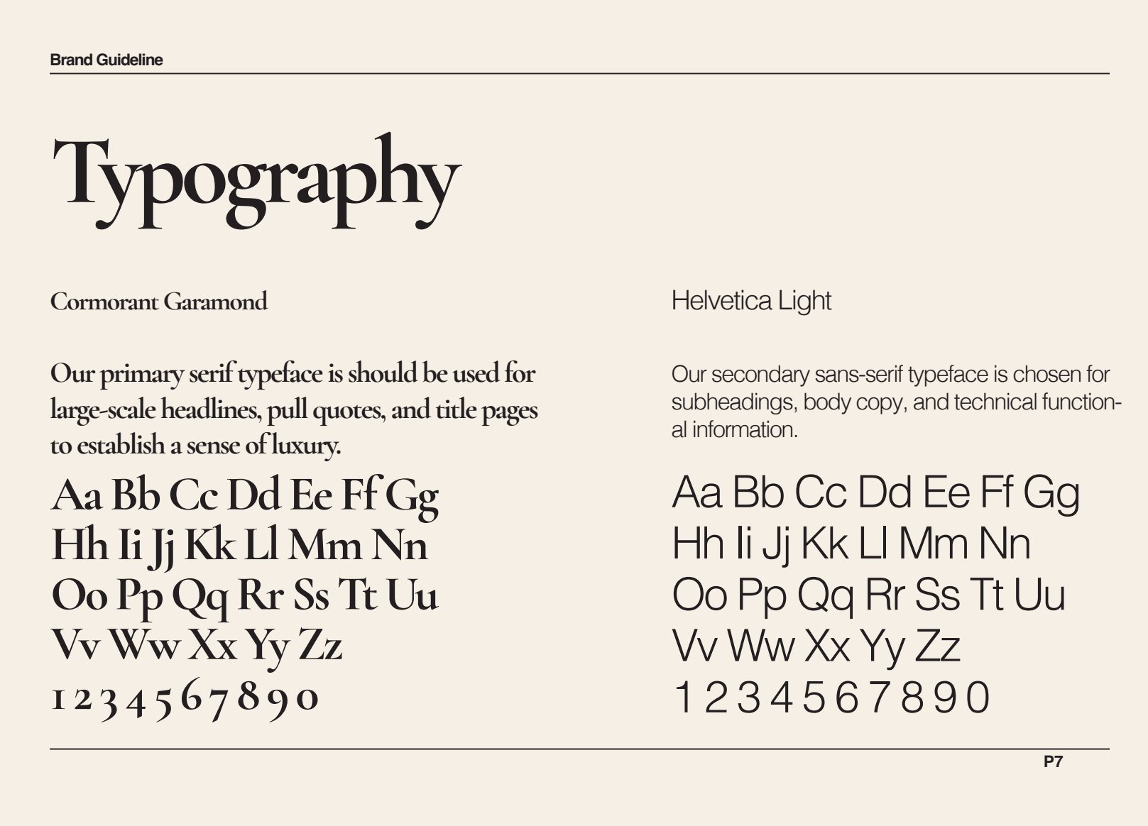
So the name is taken literally in tone rather than in image. A high waisted serif in wide letterspacing, ruled lines instead of ornament, and no illustration anywhere in the system. The joke is carried by restraint, not by the drawing.
The system
Three marks, three colours, no fourth
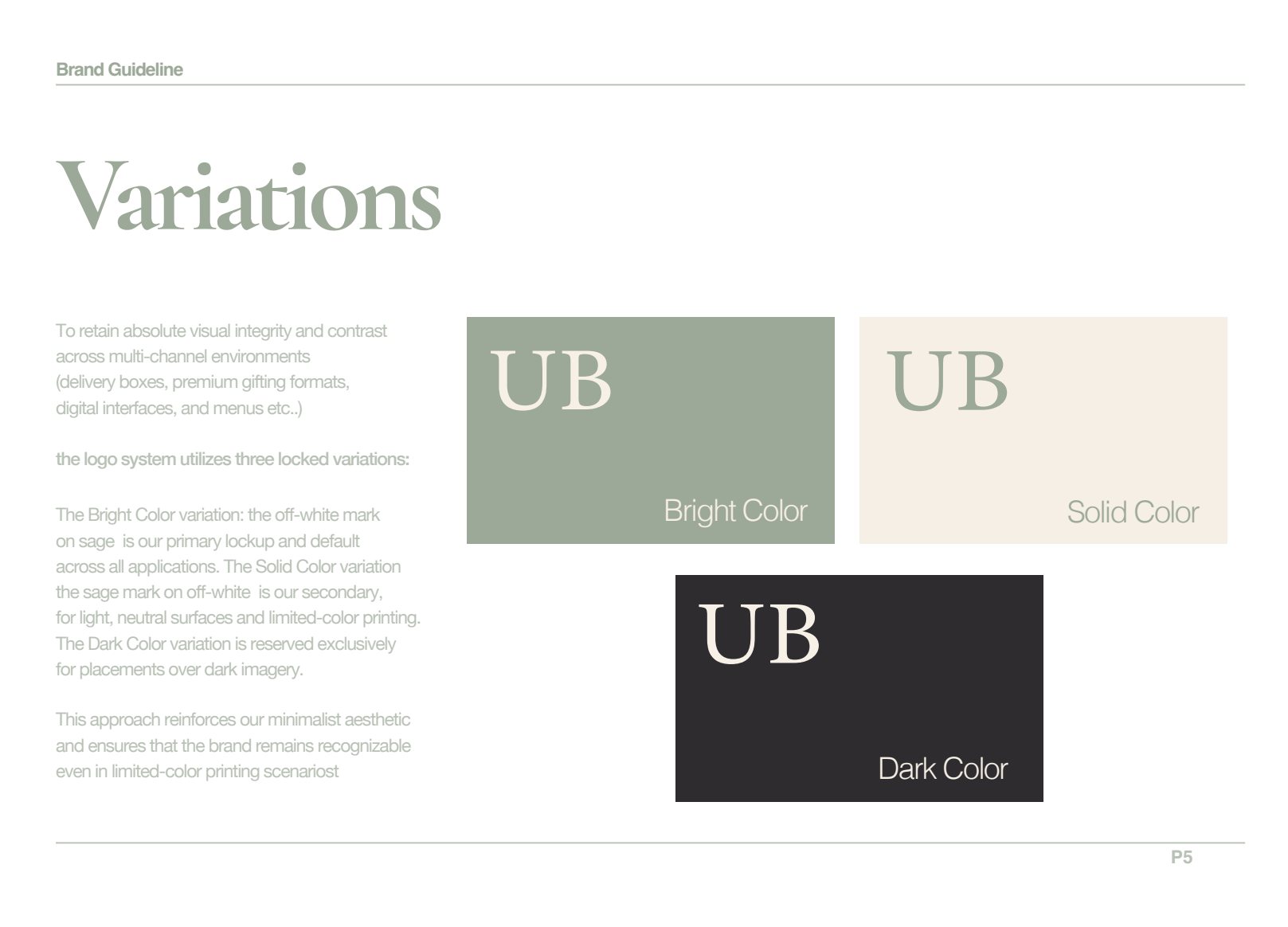
Three marks cover every situation. The full wordmark for storefronts and packaging, a UB monogram for stamps and small applications, and an Arabic lockup drawn against the Latin rather than translated after the fact.
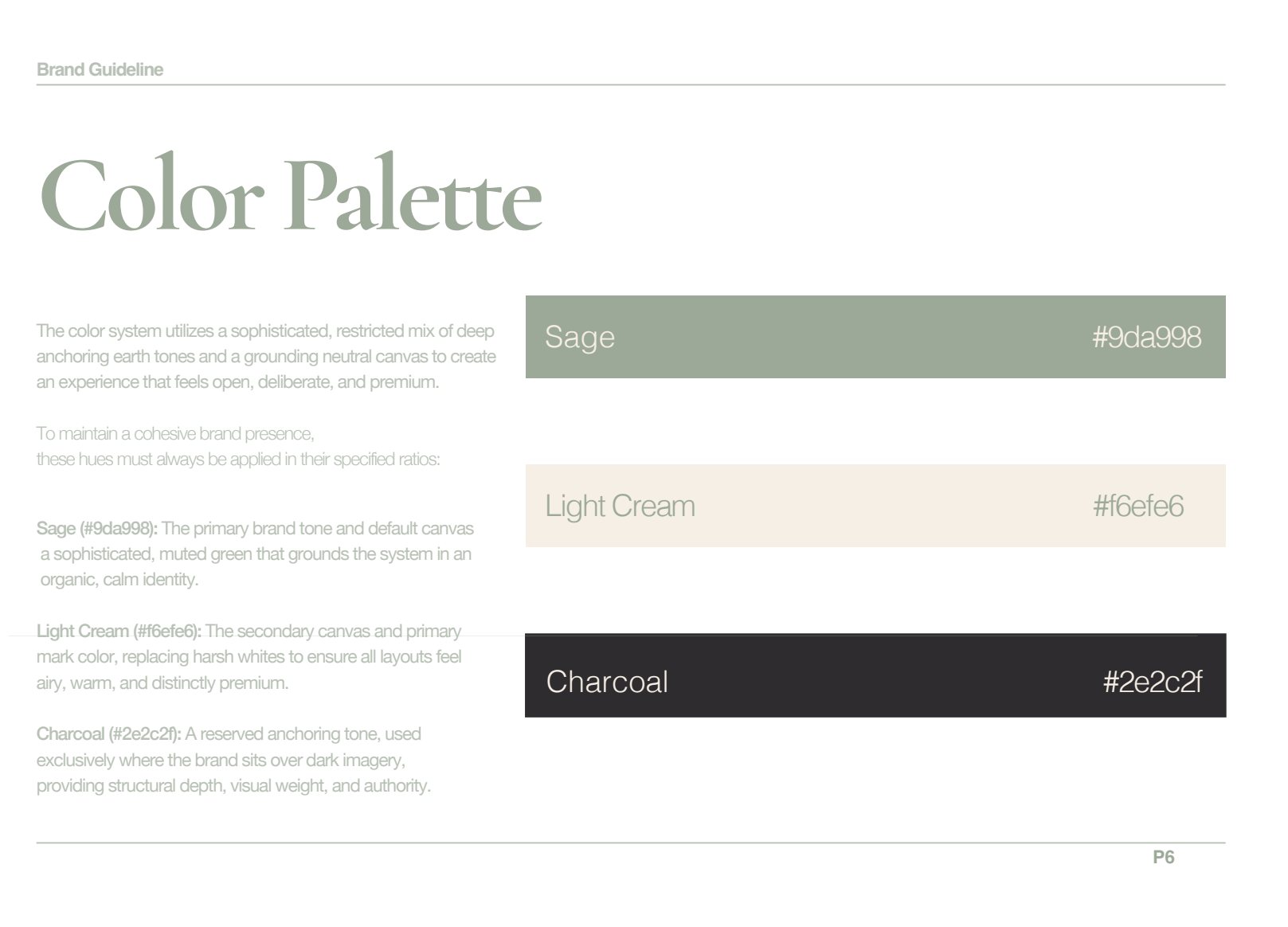
The palette is three flat colours. Sage carries the brand, light cream takes the backgrounds, charcoal does the reading. Nothing in the system needs a fourth colour to work, which is what keeps a one colour bag looking deliberate.
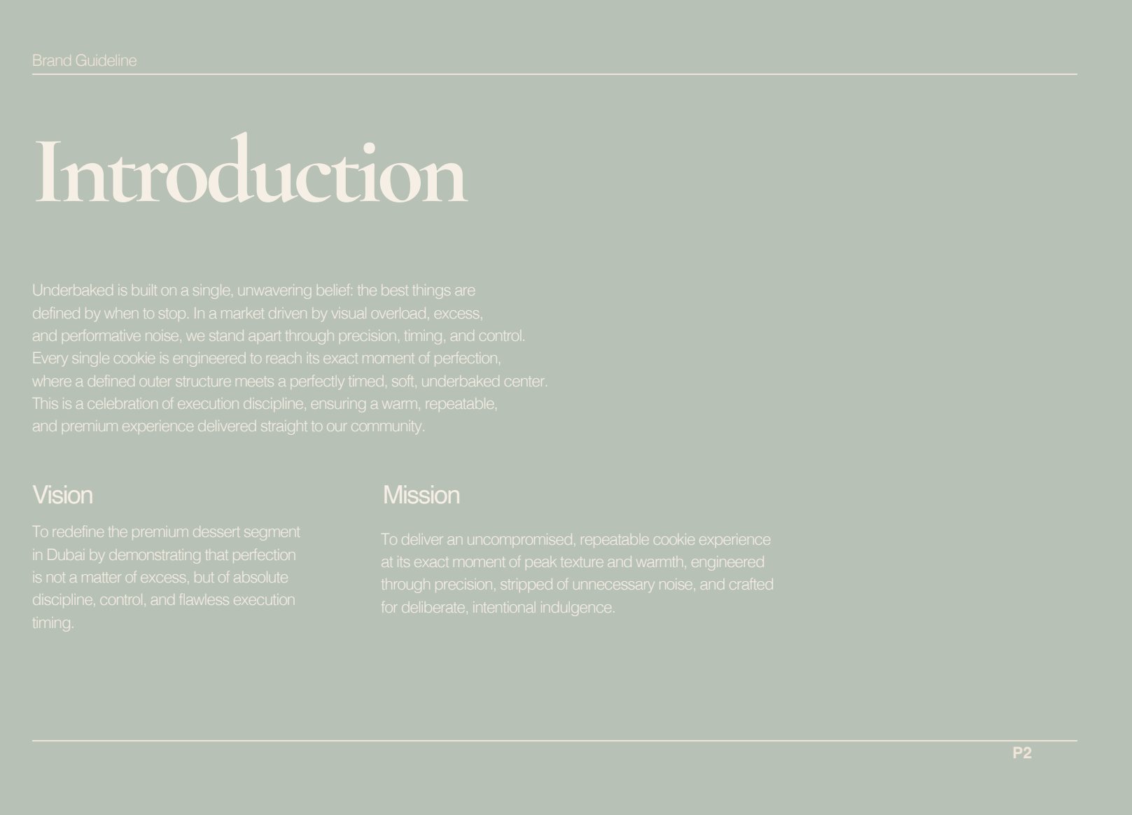
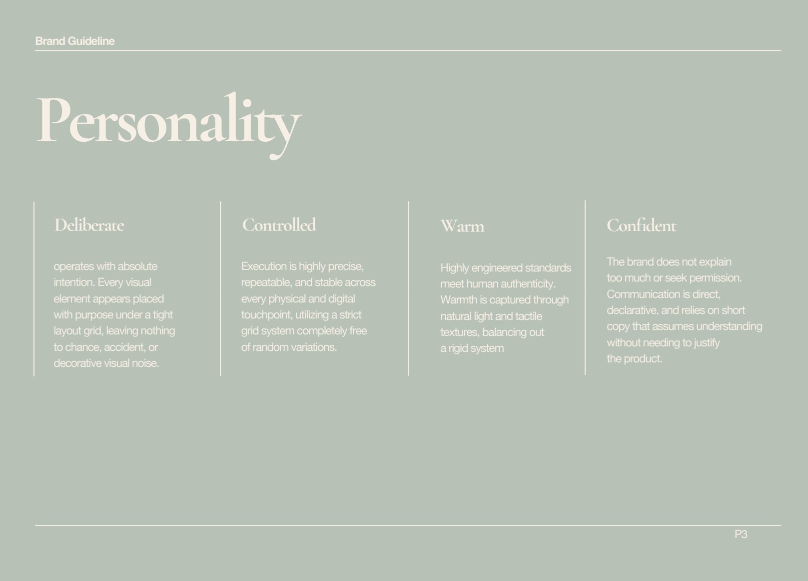
The guidelines specify everything as a rule rather than an example, because examples get copied and rules get followed. Someone laying out a new label has four decisions to make and cannot make any of them wrongly.
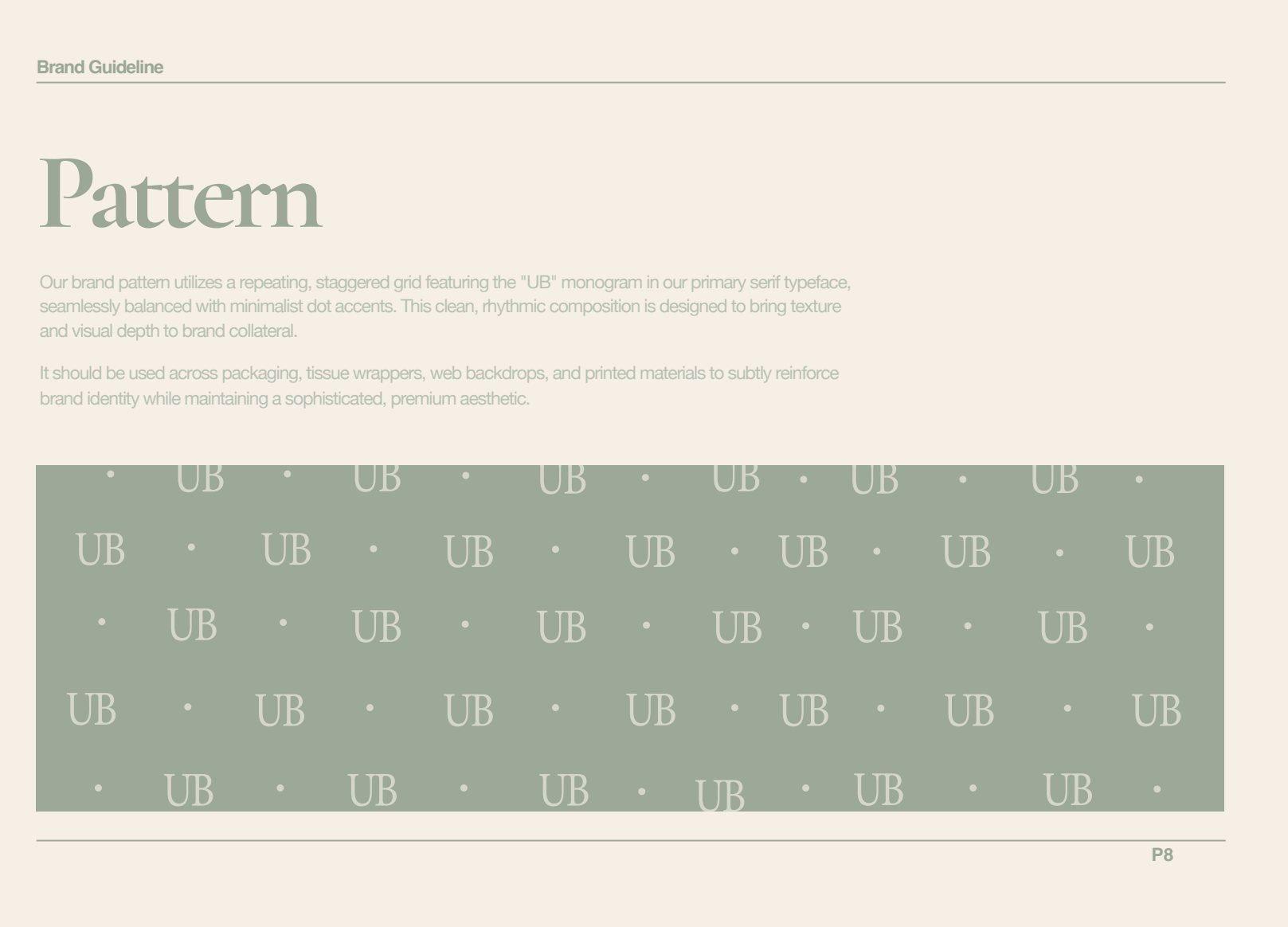
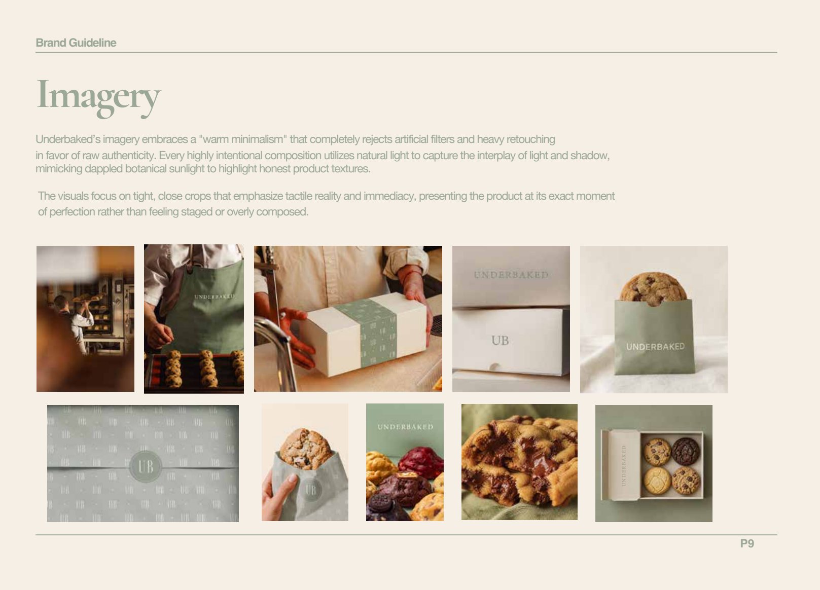
Examples get copied. Rules get followed.Underbaked, bakery and cafe
Specification
- Marks
- Wordmark · UB monogram · Arabic lockup
- Palette
- Sage · Light cream · Charcoal
- Deliverables
- Strategy · Identity · Bilingual type · Guidelines